How to Effectively Add Texture to Your Website
By Sara StuartIf you take a look around the web, you might have noticed a trend for flat design. For most designers, myself included, this simple aesthetic is a dream come true. We’re taught from the beginning that “less is more” and until now, it seemed impossible to convince clients that this mantra holds a lot of truth to it. Now, the days of heavy gradients and texture usage are behind us and it’s a glorious time to be a minimalist. Don’t get me wrong, I’m a huge fan of texture, and I still believe there’s a place for it, but too much texture can cause confusion and leave a website feeling tacky.
So how can we make minimal design and texture coexist? Start by taking a good, hard look at your branding visuals and see where adding texture makes sense. Today I’d like to show you how.
First, let’s discuss what texture really is and how it’s different from a pattern.
Pattern vs. Texture
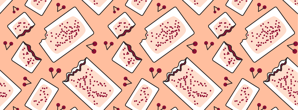
A pattern is a small, image-based element that is repeatable on the x and y axis. In other words, it makes use of symmetry by duplicating a simple image and arranging it in a predictable order to create a seamless layout. Thanks to programs like Illustrator, it’s fairly easy to create pattern designs that are repeatable, or tileable. Here’s one I’ve made for my social media outlets that highlights my love for cherry Pop-Tarts:
Textures are bigger, more complex files that refer to tactiles or surfaces. Some textures can be seen as patterns if they’re tileable, but not all have to be. They generally come in two types: visual and actual.
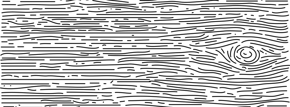
Visual Texture is art that imitates actual texture using various elements like lines, shading, and color.
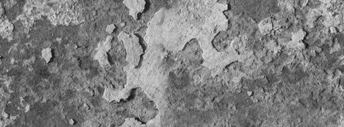
Actual Texture is exactly as the name signifies. It’s the physical rendering of real texture. Some awesome effects can be achieved by manipulating a photo or scanning in the textured surface and digitally modifying it. For better results, set your resolution to at least 300 dpi and play around with a variety of files.
If used properly, textures can effectively improve a layout by adding contrast, depth, and balance to the design which creates visual interest and weight. Some textures are so lifelike that they appeal to a viewer’s sense of sight and touch. Due to these qualities, whenever we use textures, it automatically draws attention to itself and the area from where it’s applied.
Why is Texture Important?
Flat design is timeless, clean, and functional but it can also seem artificial and bland. For example, think of what a single piece of white paper looks like. It’s not just a flat, white rectangle. There’s a subtle texture and gradient to it that indicates where the light source is from and what the paper’s surface must feel like. When you introduce a light texture to flat design, the result is interesting and it feels authentic. This is why I think texture is important. It gives your website character and allows your audience to interact with the visuals of your brand.
11 Classy Ways To Minimally Add Texture
Minimalism is the process of breaking something down into its essential elements to achieve functional design (source). With that said, one of the worst things you can ask a designer to do to make a website “pop” is by adding too much information or by including a whole bunch of design elements that won’t make sense for your brand. To keep things classy and minimal, consider a few of these ideas to add texture to your website:
1. Social Media Icons: Spice up the same social media icons everyone uses by creating a customized set that matches the tone and theme of your website.
2. Packaging and Business Stationery: Figure out how you’d like to distinguish your printed work. Texture can be applied to the backs of business cards, letterhead, or even an iphone case. You could also appeal to your client’s sense of touch by having your promotional materials printed on something untraditional, like kraft paper. In addition, think of your packaging accessories. There are plenty of ways to sneak in some texture by wrapping your thank you cards in twine or ribbon for example.
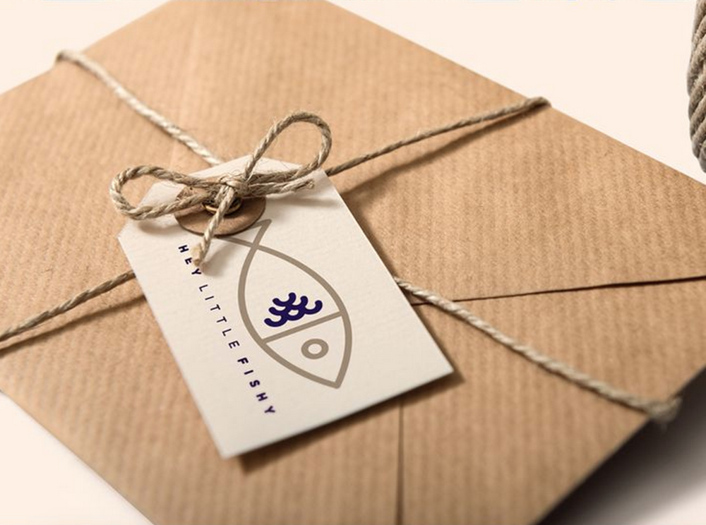 From Studio JQ: https://www.behance.net/gallery/23979655/Everybody-Loves-Fish-Chips-Branding
3. Photography: With flat design on the rise, large photographs have become a favorite for homepages as well. Take it one step further and include a recurring texture in the background while photographing spaces, products, and props. These can also be made into banners and backgrounds for promotional posts on social media.
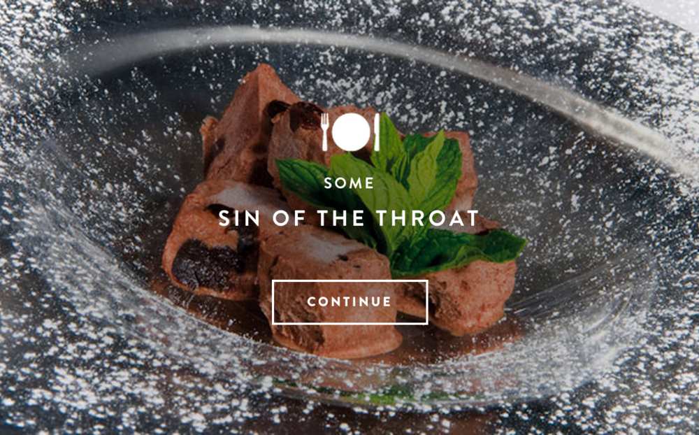 Photo from Monte Ré: http://www.montere.it/
4. Call to Action Buttons: Guide your audience to the most important parts of your website by applying a texture to your call to action buttons. This ensures that they don’t get overlooked and entices your viewers to see what you want them to see.
5. Titles / Headings: Adding a small amount of texture to your titles or headings can enhance the information hierarchy of your website and keep everything organized. Just be mindful of font legibility.
 Layout from Degordian Academy: http://academy.degordian.com/
6. Blog Post Images: Promote your latest blog posts with textured images that catch the eye and make the titles easy to read.
7. Header and Footer: Use your header and footer to your advantage by sneaking in some texture.
 Header from Olly Sorsby: http://ollysorsby.co.uk/work/
8. Dividers: Dividers separate content into logical divisions and prevent confusion. To make them stand out a little more, a subtle texture can also be applied.
9. Logo: A textured logo can be pretty effective against a clean, flat background. However, if your background is textured, consider the opposite effect and keep the logo just as it is.
10. Email Accessories: This can apply to the backgrounds of newsletter forms, images & banners in email newsletters, and email signature tags.
11. Website Icons / Illustrations: Liven up the information on your website by adding a texture to icons and/or illustrations.
 A few examples of illustrations with subtle texture. Found on the Google music homepage: https://play.google.com/music/listen#/now
Bonus:
Background Images: This is an option that I don’t normally recommend due to the fact that it looks dated and that there are very few website designs that successfully pull off a textured background. However, if you do this, my suggestion is to choose something ultra subtle so that it’s not too distracting and overloads your viewers with various visuals.
Texture Best Practices
The key to using texture lies within these guidelines:
- To reiterate, use it minimally. Think of any type of design element as an additive rather than a necessity. When texture is used heavily, it can result in an overwhelming experience for your viewers and leave them with the impression that your website is messy and untrustworthy.
- Make sure it serves a purpose and weigh out the pros and cons. If it serves no purpose and highlights the wrong information, say “sayonara” to prevent confusion and cause distraction. Texture should only be used to keep websites clean, organized, and pleasing to the eye. The goal is to highlight important information, not hide it.
- Think of the website design. Is the right content being highlighted? Are you using too many textures? Is that texture hiding anything? Consider these questions while looking at your website design. There should be a harmony that flows throughout your layout. So, “if it goes together, put it together.”
- Keep it consistent amongst all of your other branding materials. For example, your business stationery, social media and email newsletter visuals, logo style, etc. should all resemble each other no matter what.
- Create an experience. Envision your brand and choose textures that help communicate your theme and overall tone. Keep it subtle and don’t get carried away with really bold elements the shift the focus off of your most important content. Remember the type of audience you’d like to attract and how you want them to feel about you. If you can use texture to achieve this in any way, go for it.
I strive to create timeless and functional pieces for my clients that are representational to their brand and intended audience. It’s important to note that texture is not necessarily needed for every website. If it doesn’t suit your theme or overall design and feels like a random or forced element, then it probably isn’t right for you. Whether you’re having a website designed for you or are going at it yourself, try a texture or two and see where it leads.
